SQUATGUMMI

©2026

A MODERN PERFORMANCE SUPPLEMENT BRAND DESIGNED TO SIMPLIFY STRENGTH TRAINING THROUGH APPROACHABILITY.

SCROLL FOR MORE


// 01

PROJECT OVERVIEW

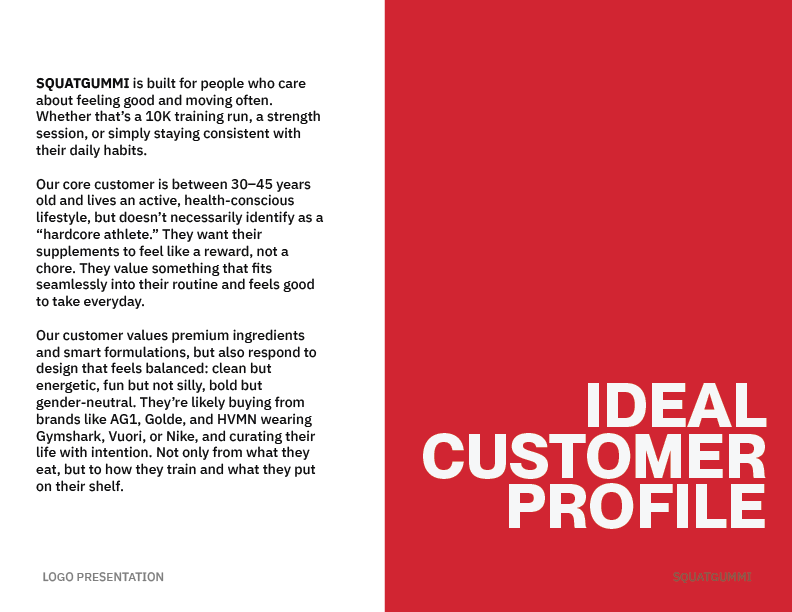
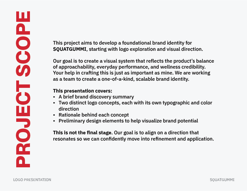
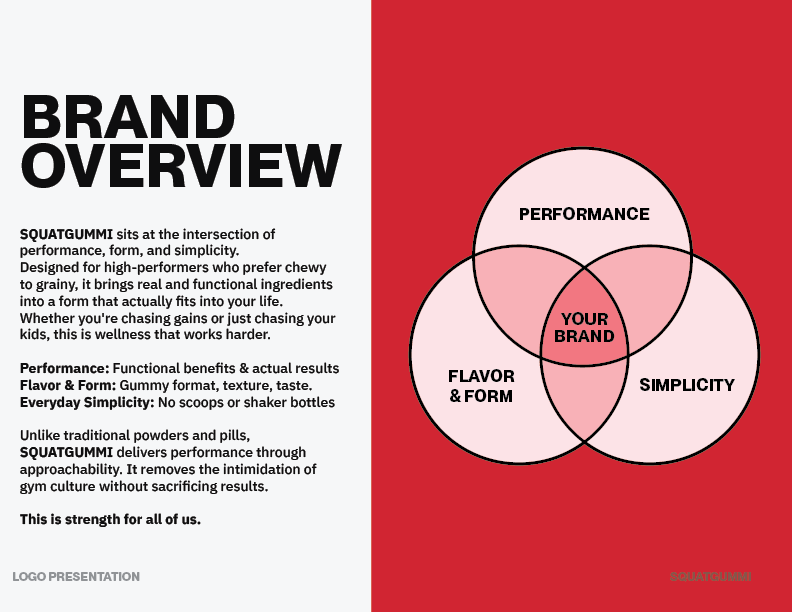
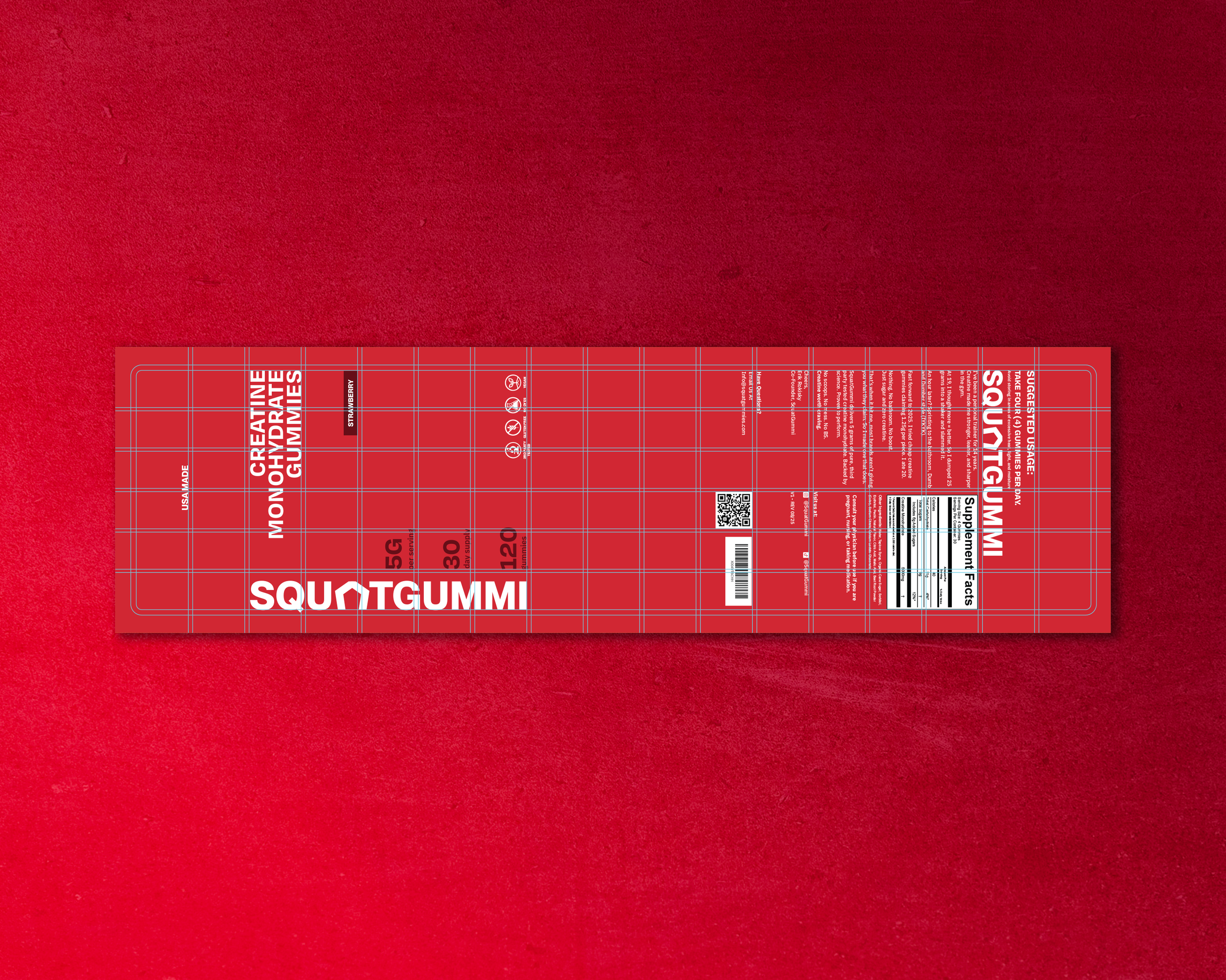
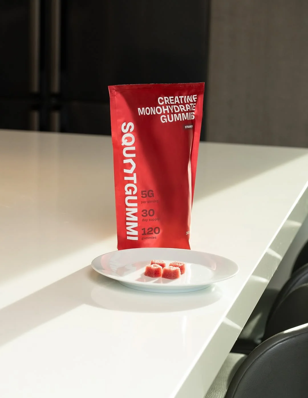
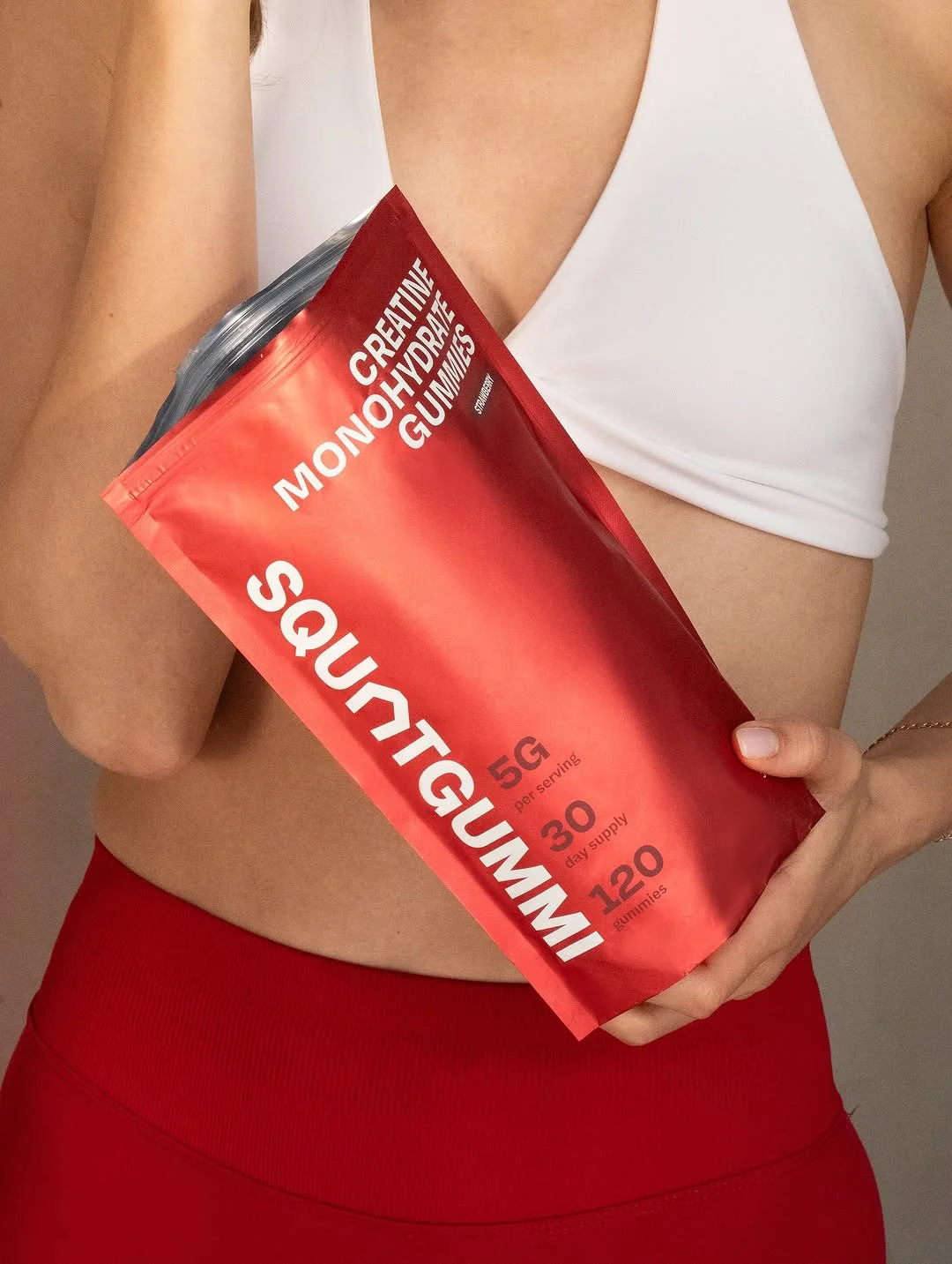
SquatGummi is a creatine gummy brand designed for active people who don’t identify with traditional gym culture. Entering a crowded Amazon category, the challenge was to create a clear, distinctive brand and packaging system that could stand out quickly without relying on familiar fitness tropes. The result prioritizes clarity and recognizability across packaging and social media within a tight budget and timeline.

PROVIDED SERVICES

YEAR

Brand identity design

logo and symbol development

packaging design

visual system creation

social media system support

2025

Red presentation slide with white bold text reading 'SQUATGUMMI' and smaller text at the top 'LOGO PRESENTATION' along with additional small text at the bottom indicating stages like onboarding and branding exploration.
A graphic display of a customer profile for a fitness brand called SQUATGUMMI. The left side contains a paragraph describing the target customer as health-conscious adults aged 30-45 who value premium ingredients, balanced design, and a lifestyle centered on feeling good and staying active. The right side features a bold red background with the white text "IDEAL CUSTOMER PROFILE."
Slide titled 'Project Scope' discussing developing a brand identity for SQUATGUMMI, including logo exploration, visual system, and brand elements.
Design explanation sheet showing a logo comparison between 'SQUATGUMMI' and 'SG', including typography choices, layout, and visual details.
Logo design with the text 'SQUATGUMMI' in bold, black font, and the initials 'SG' on the right, separated by a vertical line, on a light gray background.
A presentation slide with the title 'KEYWORDS' and two columns of words in red text. The left column includes 'FUNCTION-FIRST,' 'CLEAN,' 'CONFIDENT,' 'CASUAL,' 'MODERN,' 'TEXTURAL,' 'BOLD,' 'DAILY DRIVER,' and 'NEUTRAL.' The right column features 'GYM-ADJACENT,' 'TACTICAL,' 'ENERGETIC,' 'LIVELY,' 'YOUTHFUL,' 'PERFORMANCE-LED,' 'EGO-NEUTRAL,' 'ROUTINE-READY,' and 'FLAVOR-FORWARD.' The background is gray, with small text at the bottom reading 'LOGO PRESENTATION' and 'SQUATGUMMI.'
A graphic design layout illustrating typography options on a white background. The left side features a red section with white text reading "SQUAT GUMMI" and "CREATINE WORTH CRAVING," along with a description and a button labeled "SHOP GUMMI." The right side displays three font styles (Variable, Bold, Medium) with sample text and font details, titled "TYPOGRAPHY."
Brand overview flyer for SquatGummi, featuring a three-circle Venn diagram highlighting Performance, Flavor & Form, and Simplicity, with a description of the product's benefits and presentation.

// 02

BRANDING APPROACH

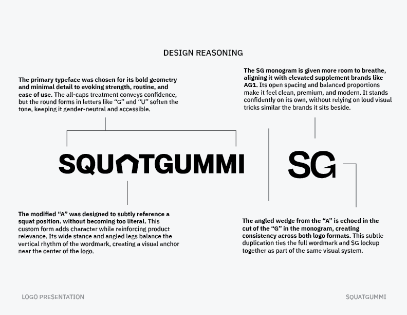
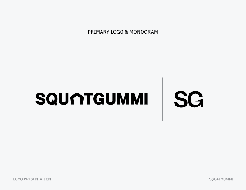
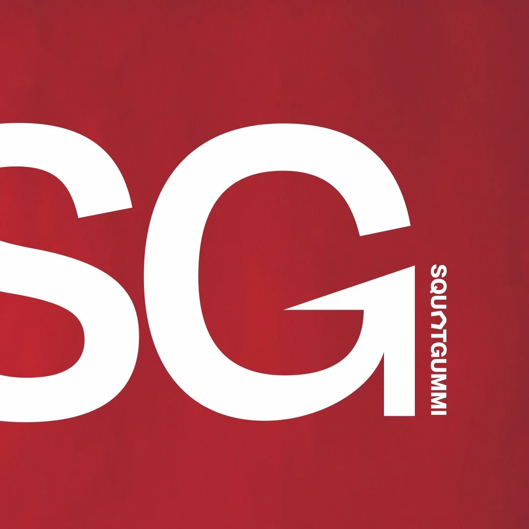
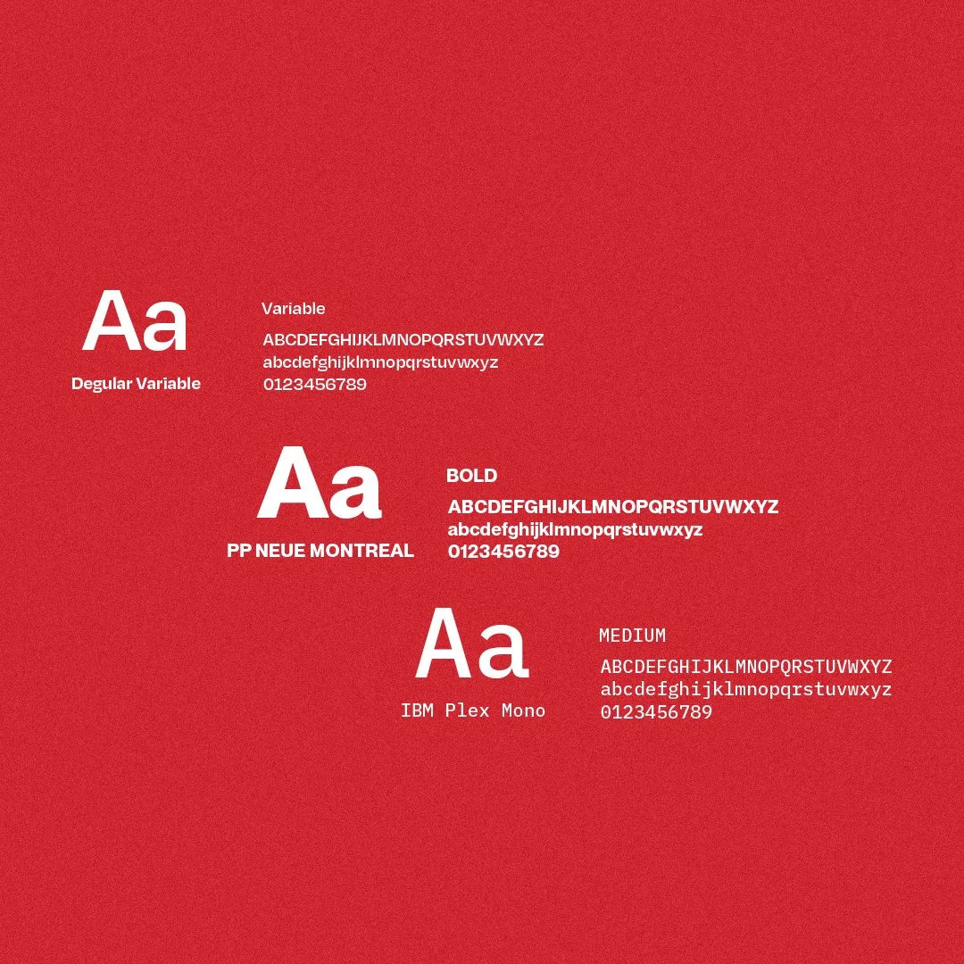
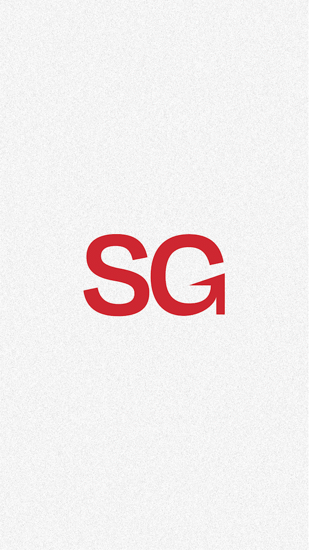
LOGOMARK CONSTRUCTION

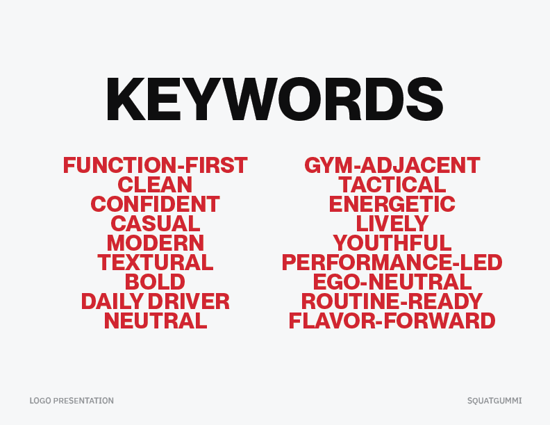
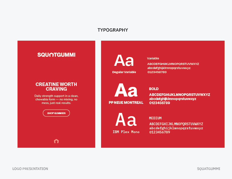
Research across wellness and functional nutrition brands informed an identity that balances strength with approachability. Typography anchored the system, favoring structure and restraint over aggressive cues. Subtle letterform adjustments introduced motion without relying on literal symbolism, allowing the identity to scale naturally into packaging. A restrained color palette, negative space, and horizontal typography support a bold, contemporary system designed to perform across digital and physical environments.

Multiple red sugar-coated gummy candies arranged in a grid pattern with shadows, and the word 'SQUATGUMMI' in bold white letters overlaying the candies.
Red rectangular packaging for gummy supplements with white grid pattern, branding, and barcode, placed on a red surface.
A red package labeled 'Creative Monohydrate Gummies' with nutritional info, placed on a white surface near a white plate with three pink gummy candies, in a room with dark furniture.
Close-up of the text 'SG' in large white font on a red background, with the name 'SQUATGUMMI' written vertically beside the 'G'.
Comparison of three different font styles on a red background, showing uppercase and lowercase letters, sample text, and numbers for each font.
Person holding a red packet of supplement labeled 'CREATINE MONOHYDRATE GUMMIES'.
Red text 'SG' on a white background.

// 03

OUTCOME

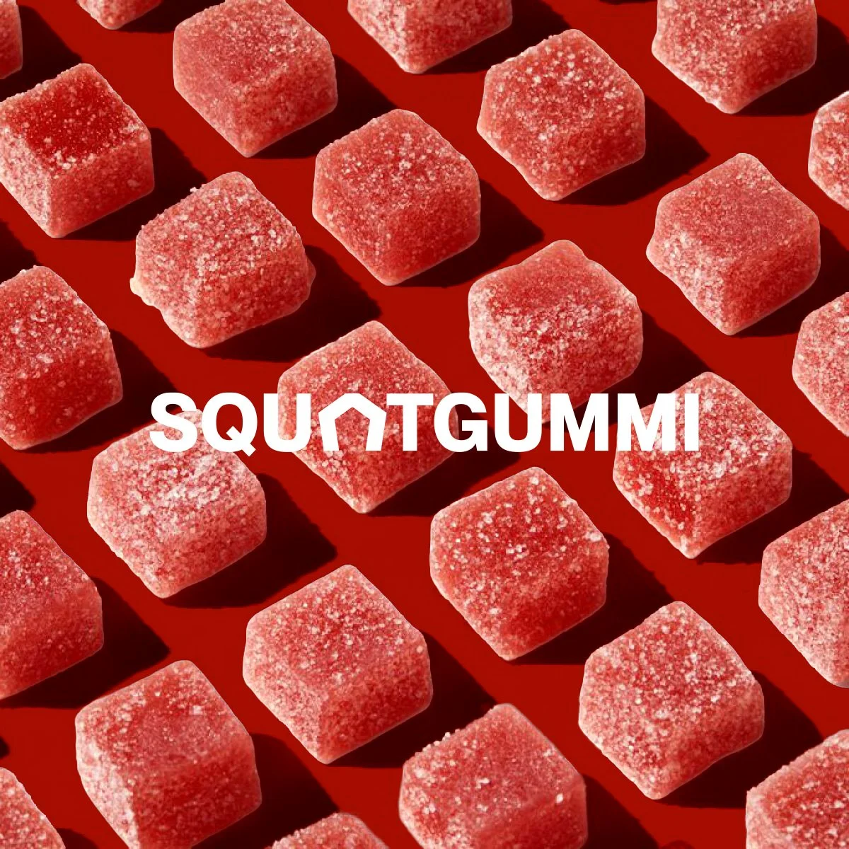
The final system established a clear, recognizable presence across packaging, social, and digital touchpoints, allowing SquatGummi to stand out quickly in a crowded Amazon category. A flexible logo, bold typography, and restrained color palette support strong shelf recognition and future product expansion.

Clear system rules simplified production and maintained consistency across applications. The brand breaks from typical creatine aesthetics, balancing approachability with strength to feel modern and credible within the category.