
TYPOGRAPHY
©2026
TYPOGRAPHY SYSTEMS BUILT FOR CLARITY, SCALABILITY, AND BRAND EXPRESSION
SCROLL FOR MORE
TYPEFACE BUILD
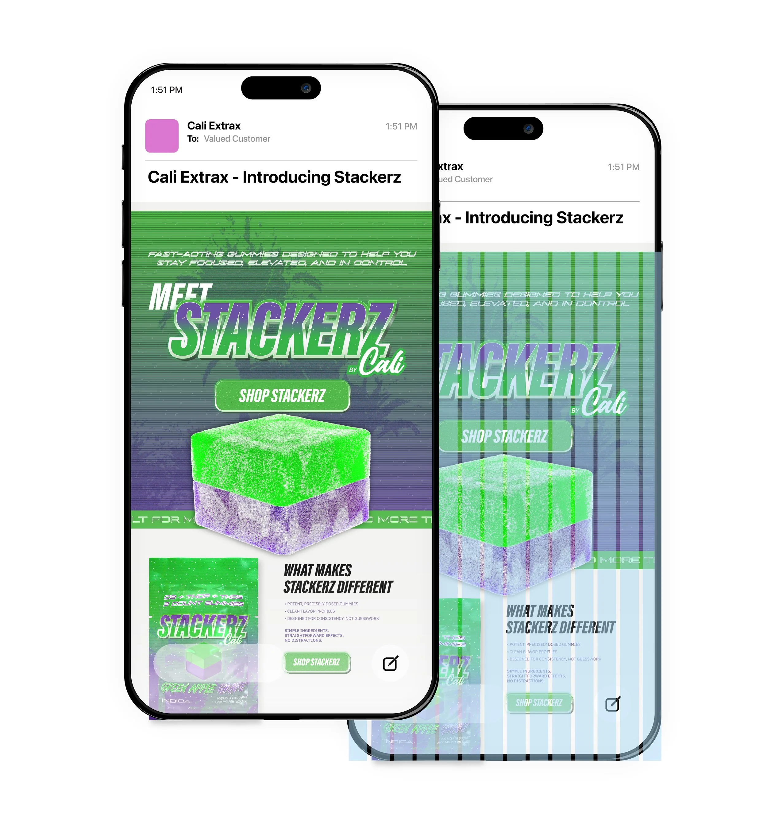
EMAIL LAYOUT
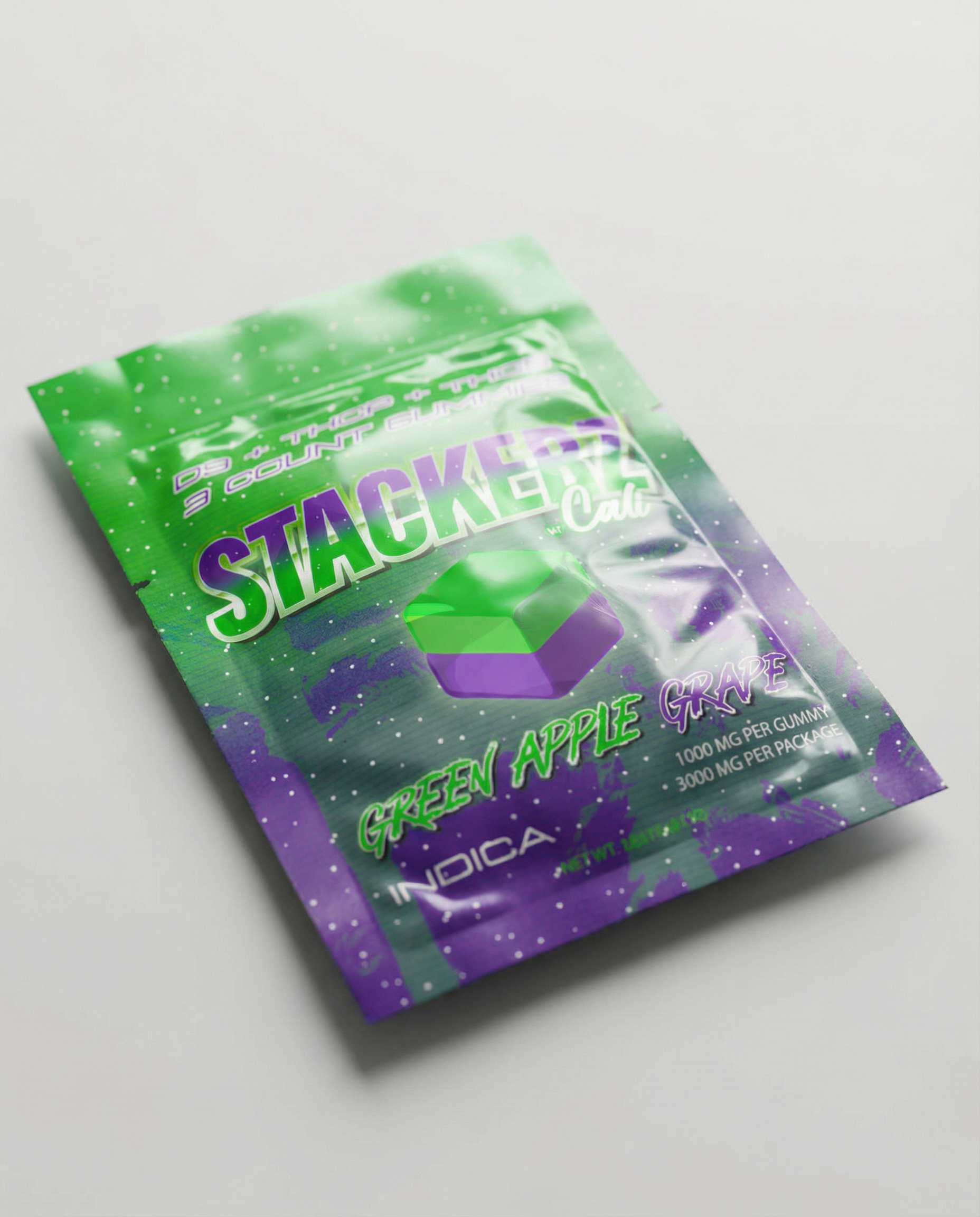
PACKAGING LAYOUT
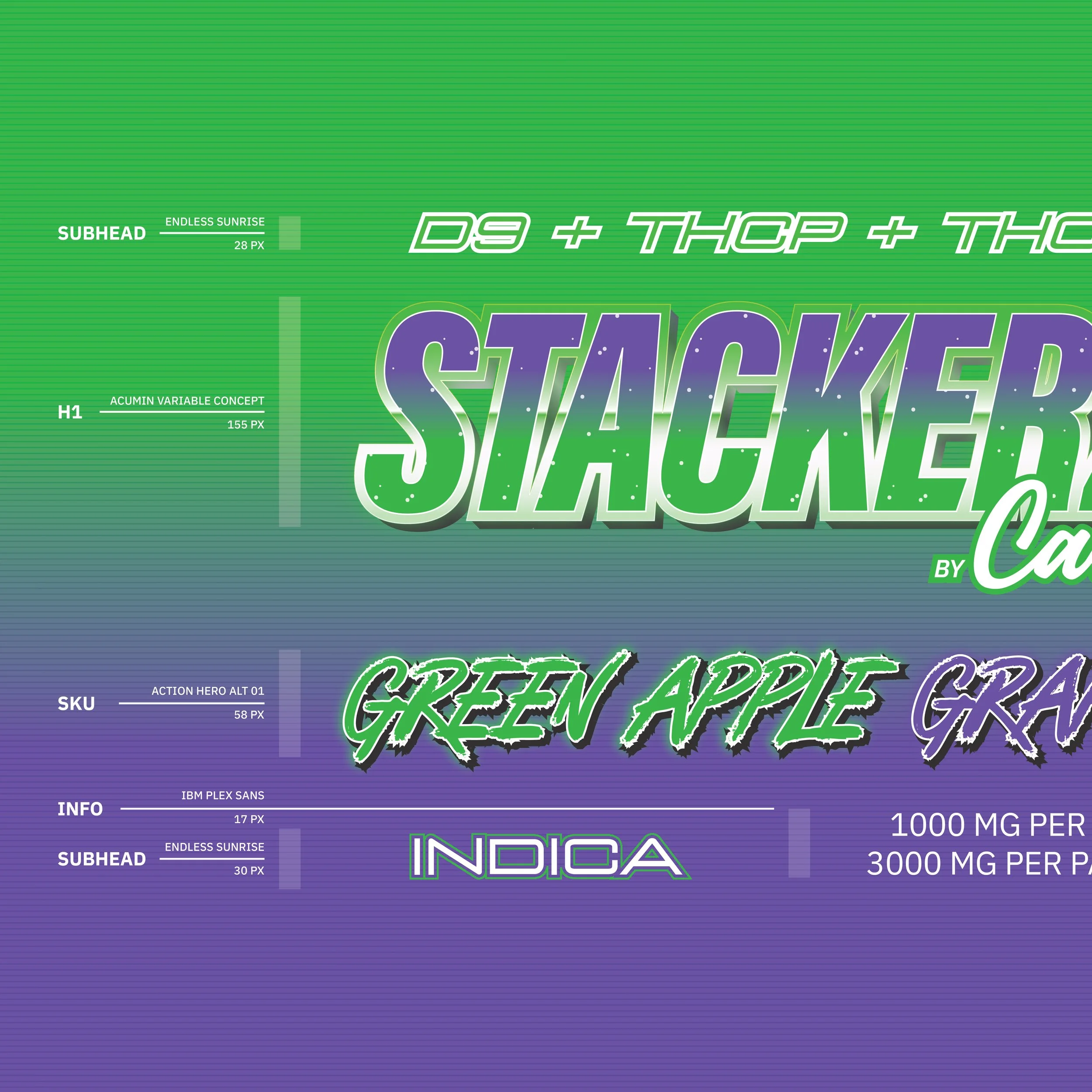
// PACKAGING TYPOGRAPHY SYSTEM
The Stackerz typography system was built to deliver high visual impact while remaining structured and controlled. Condensed, expressive headlines establish immediate presence, while clearly defined subhead and information layers maintain hierarchy across packaging and email marketing. The system balances bold personality with restrained body text to preserve readability within regulatory and layout constraints, allowing the brand to feel energetic without sacrificing usability or consistency.
TYPE hierarchy
STACKERZ BY CALI
TYPEFACES ON WEB
LINE SPACING
Type Customization
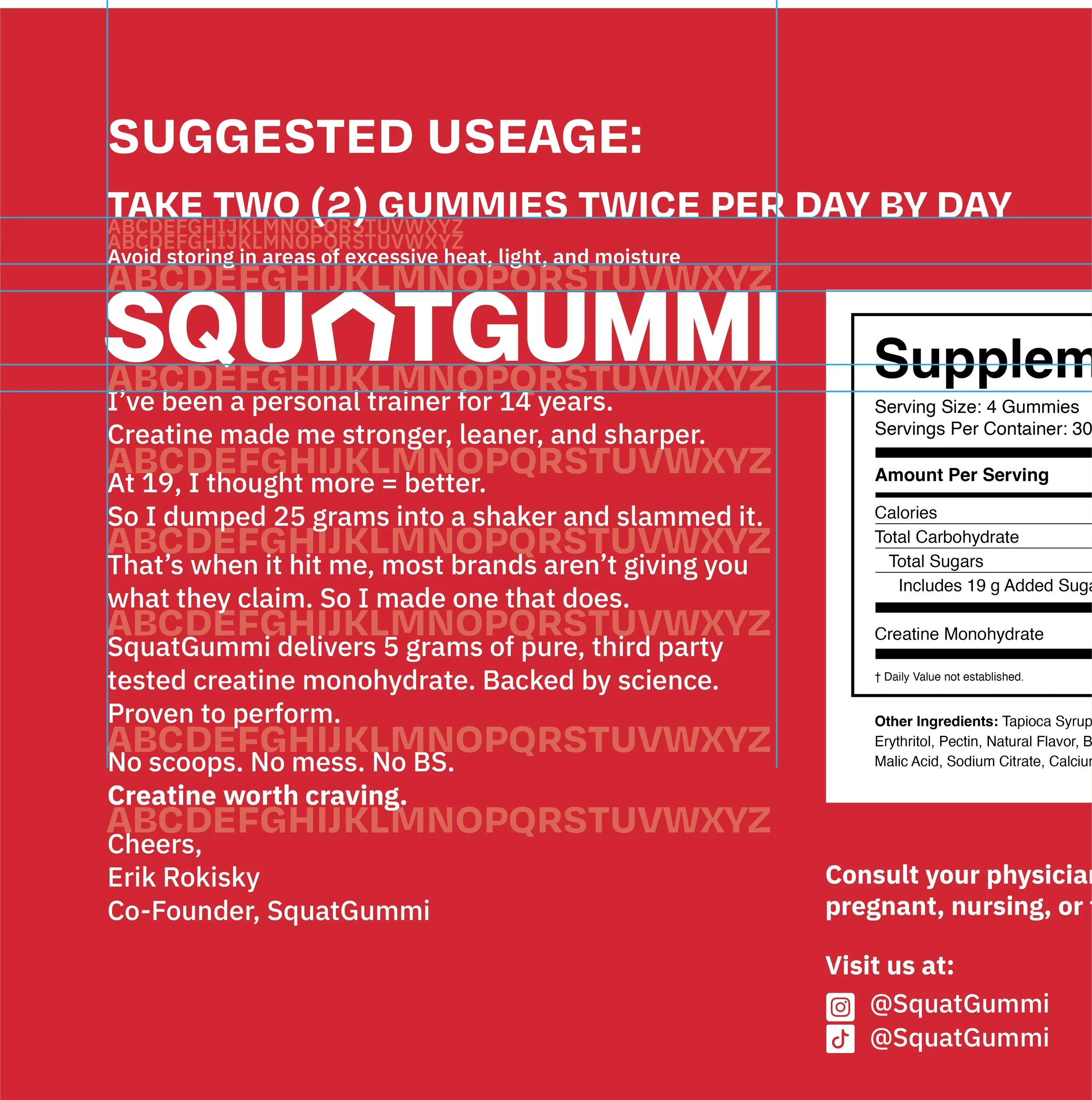
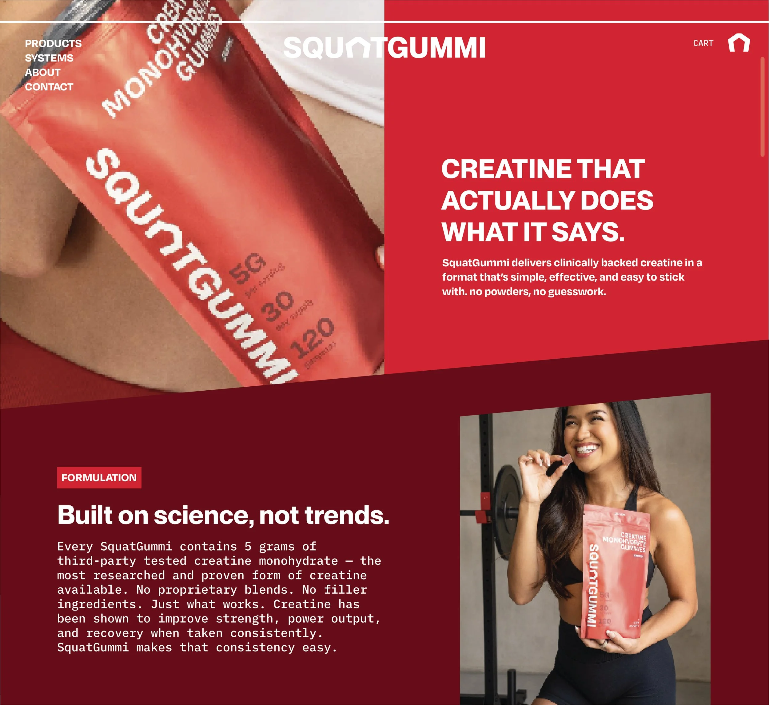
// SUPPLEMENT BRAND TYPOGRAPHY
SquatGummi typography was designed to reduce friction in a crowded supplement category by prioritizing clarity and approachability. Confident headlines are paired with highly legible supporting text to make functional information such as dosage, benefits, and usage easy to scan and understand. Type choices were intentionally neutral and modern, allowing the brand to feel credible and trustworthy without relying on aggressive fitness cues, and to perform consistently across packaging, digital, and marketing touchpoints.
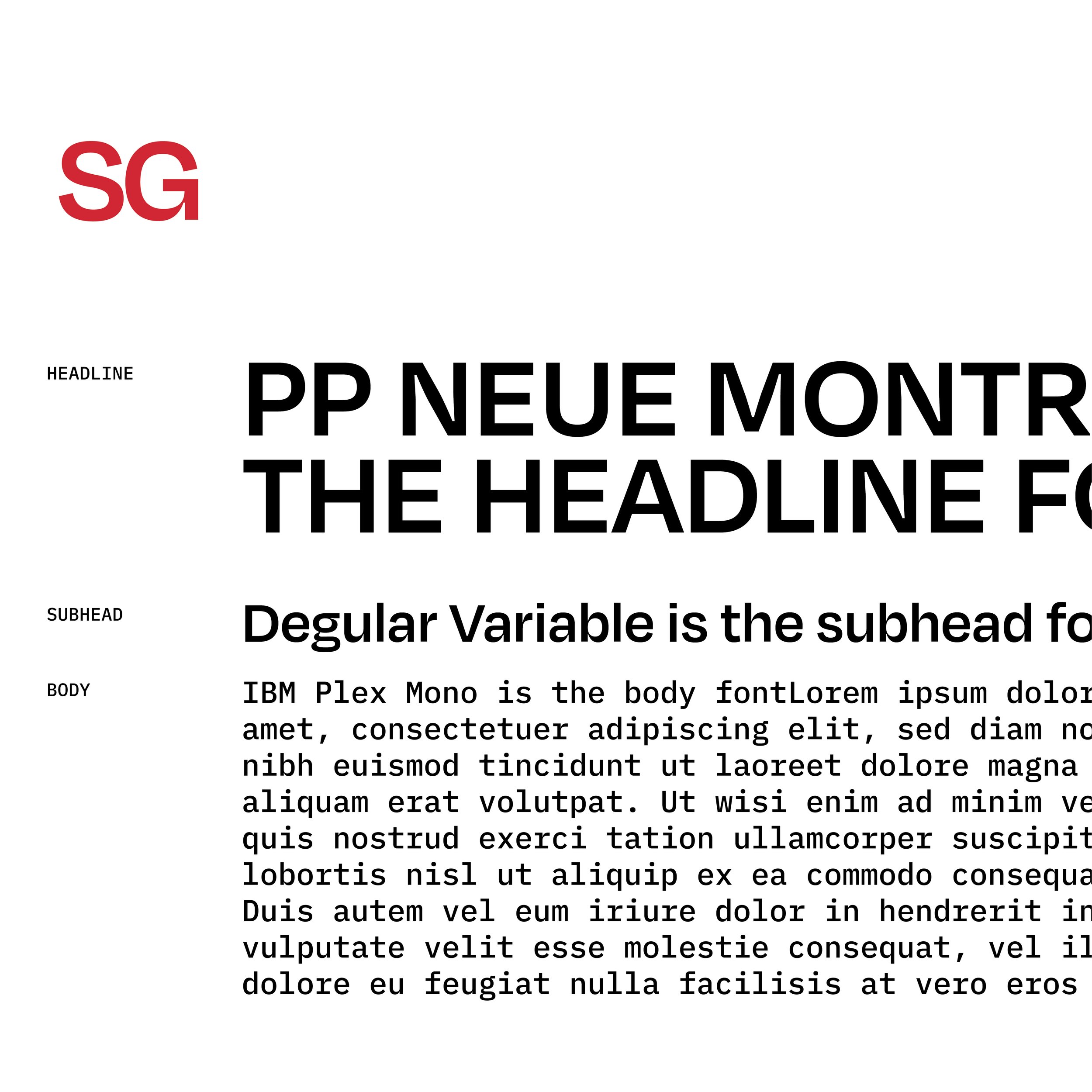
TYPEFACE hierarchy
SQUATGUMMI
TYPEFACE REFRENCE GUIDE
TYPEFACE CUSTOMIZATION
LETTERFORM Anatomy
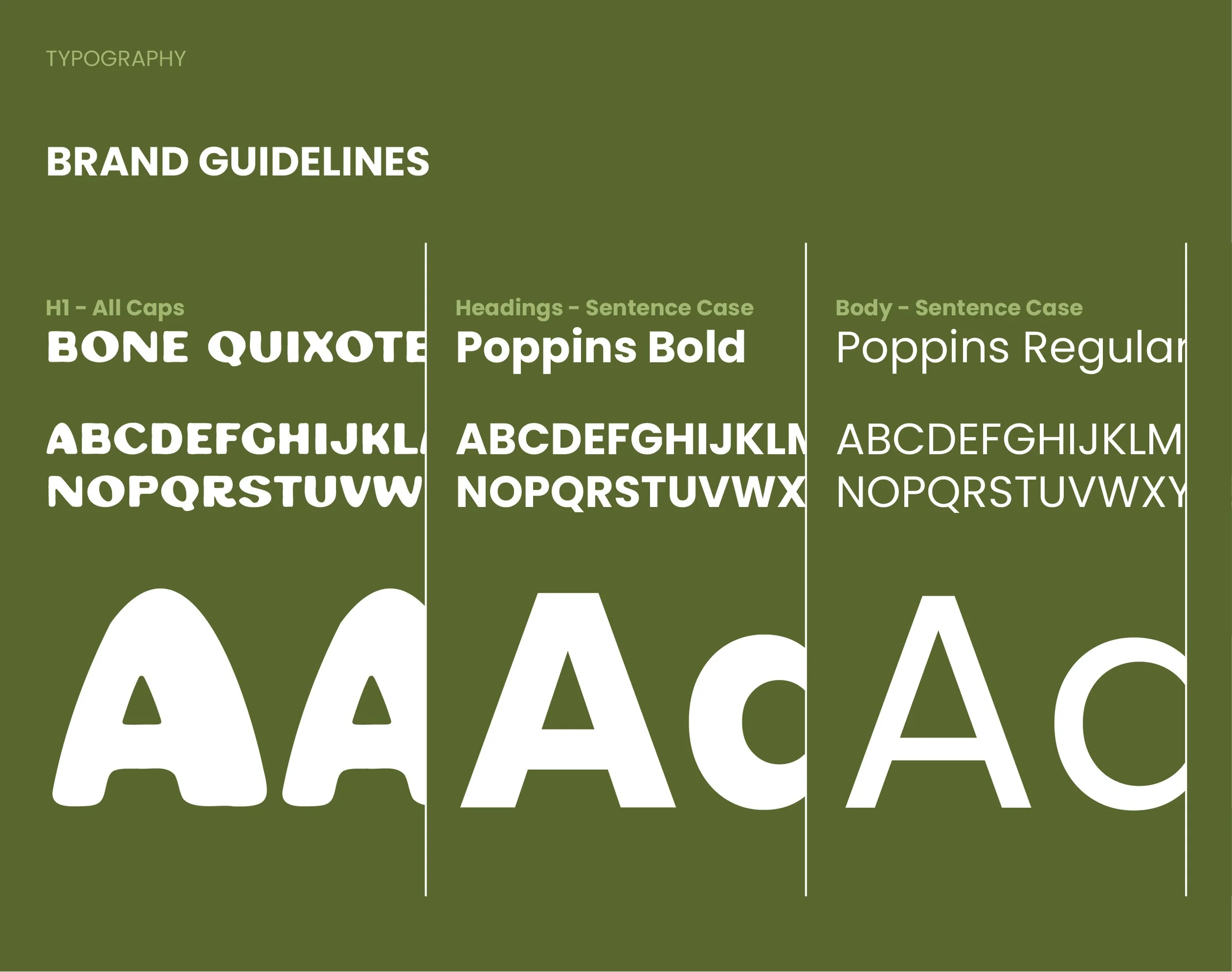
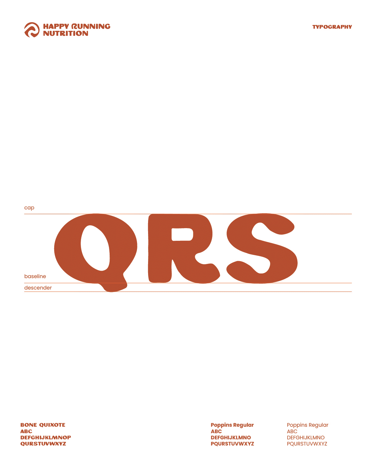
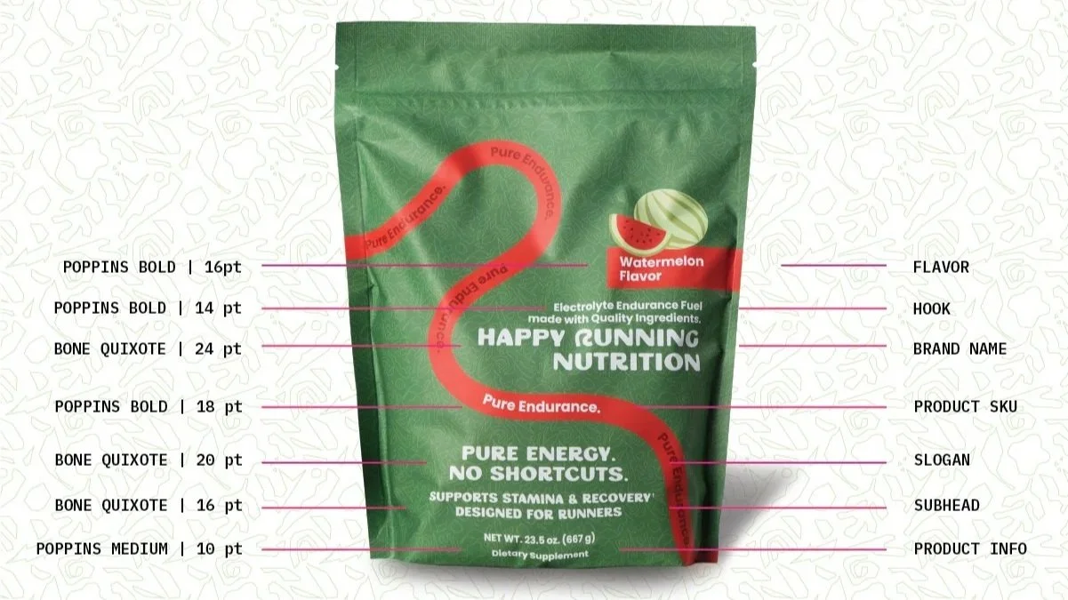
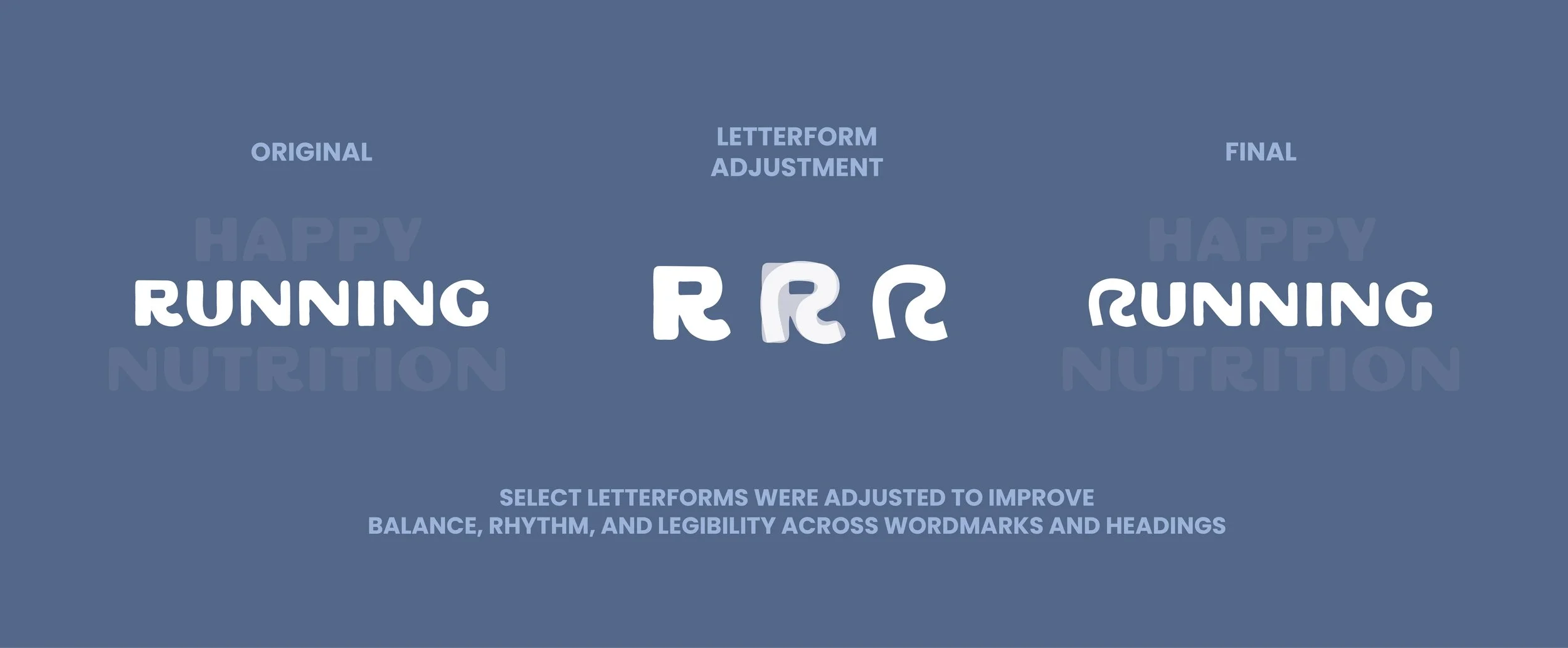
// ACTIVE NUTRITION TYPOGRAPHY SYSTEM
The typography for Happy Running Nutrition was built to feel energetic, optimistic, and human while maintaining clarity. Hierarchy plays a central role in guiding runners quickly to key information, while expressive headline styles are paired with straightforward body copy to balance personality with legibility. The system was designed to scale across packaging, social, and web environments while preserving a sense of momentum and accessibility.
PACKAGING hierarchy