Happy Running Nutrition
©2024
A BOLD, ORGANIC BRAND IDENTITY DESIGNED TO MAKE RUNNING NUTRITION FEEL LESS INTIMIDATING AND MORE HUMAN.
SCROLL FOR MORE
// 01
PROJECT OVERVIEW
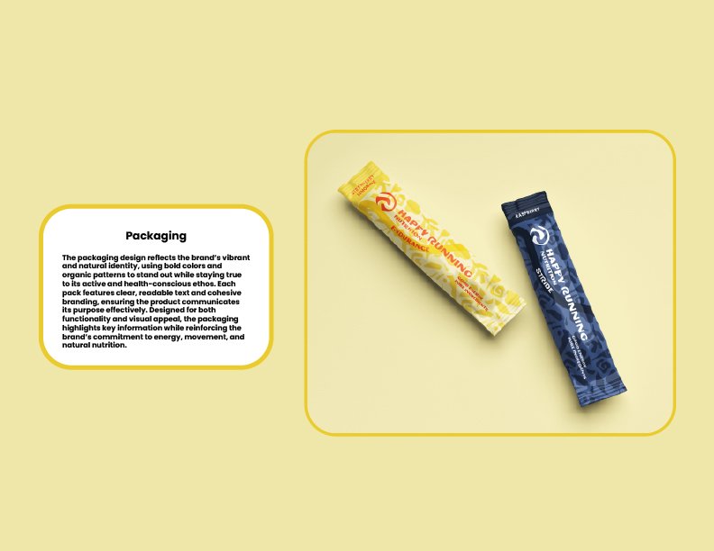
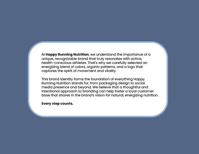
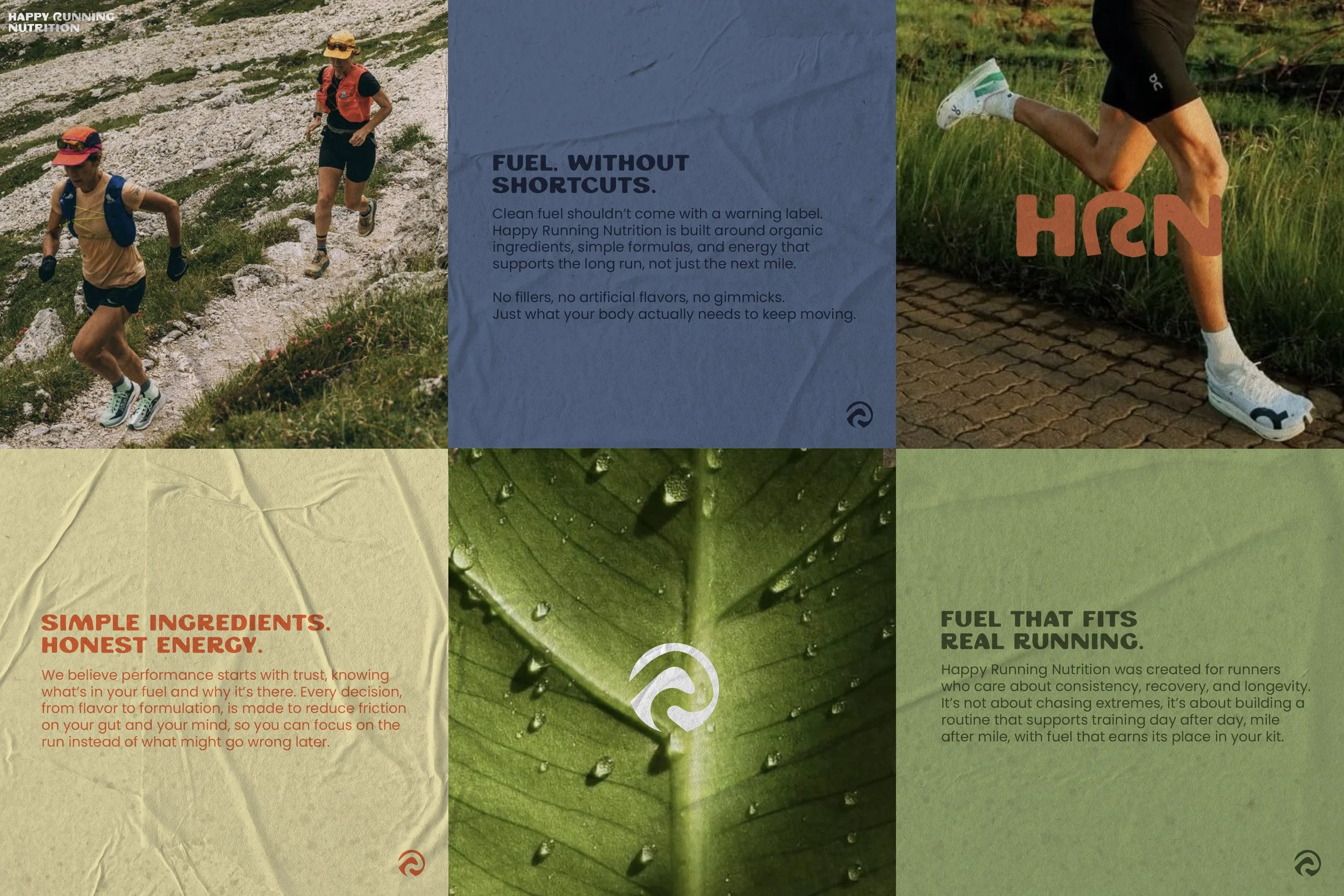
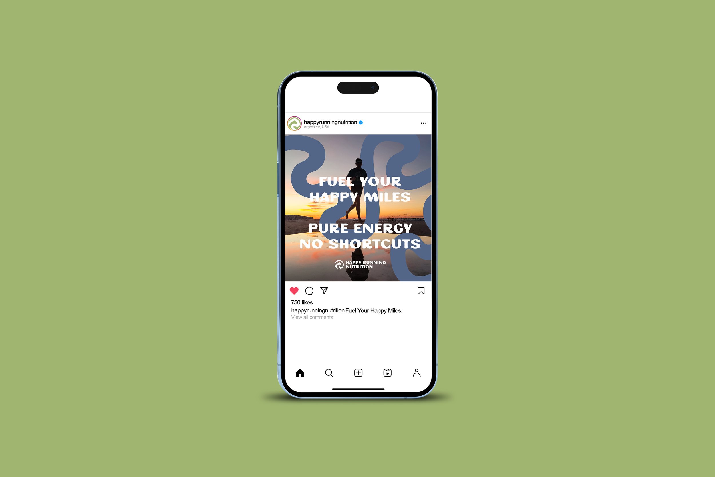
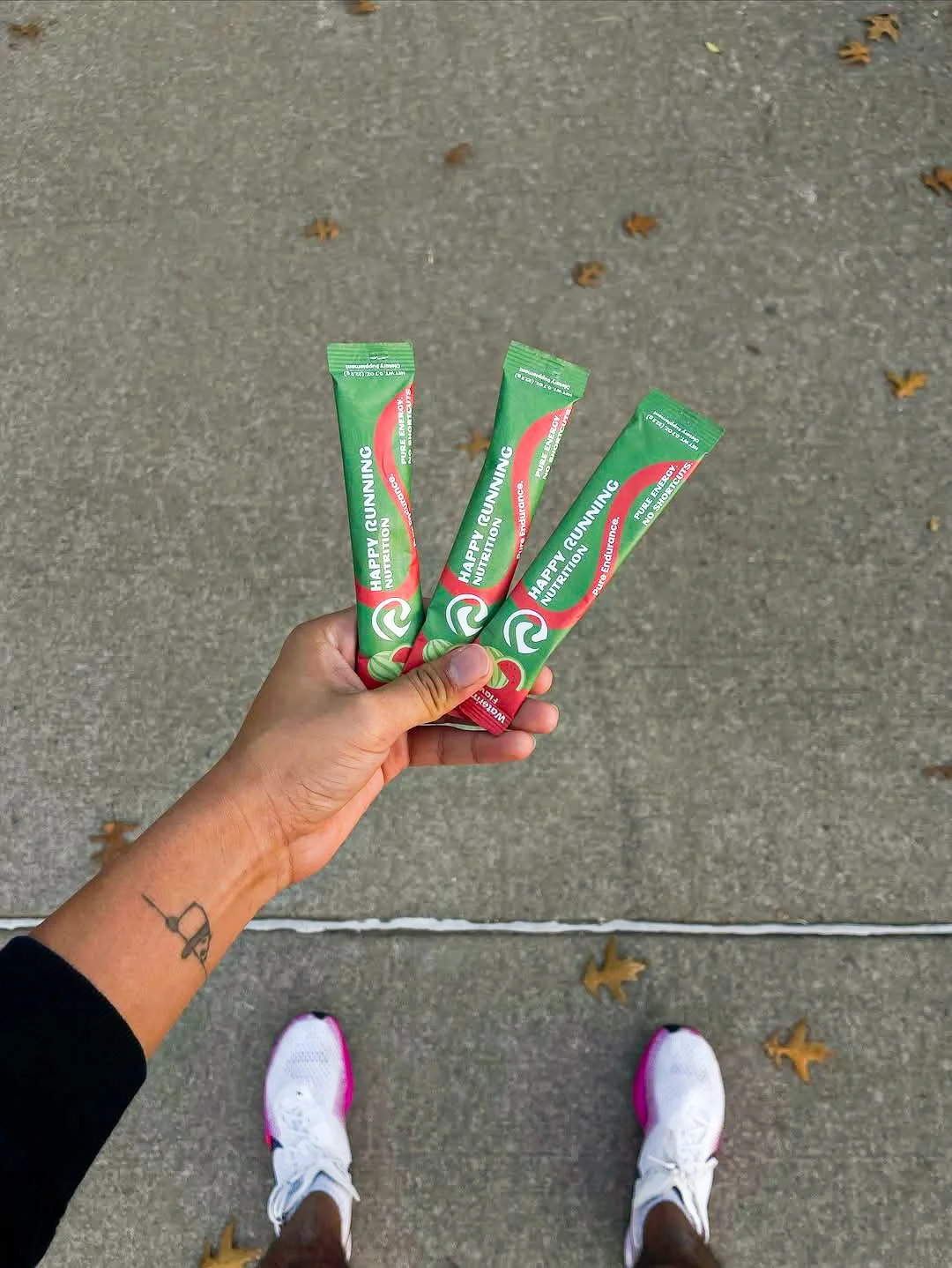
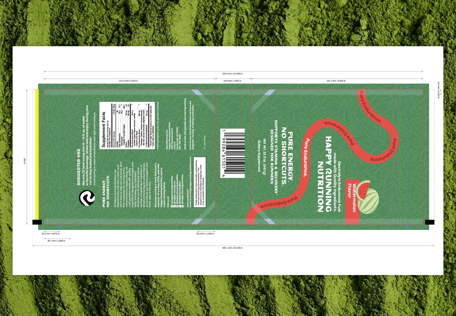
Happy Running Nutrition is an organic electrolyte and carbohydrate drink mix built for runners of all levels. In a crowded performance nutrition category, the challenge was to clearly communicate clean ingredients and runner-specific fuel while maintaining credibility. The resulting brand and packaging system prioritizes clarity, transparency, and shelf distinction across digital and physical touchpoints.
PROVIDED SERVICES
YEAR
Brand identity
Pattern Graphics
Illustration
Packaging Design
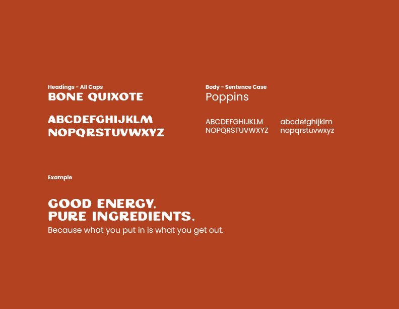
typography
2024
// 02
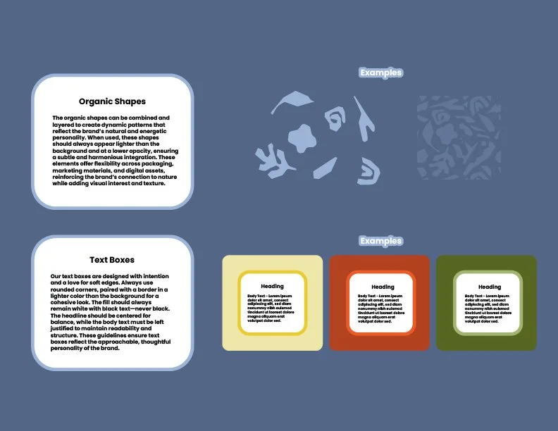
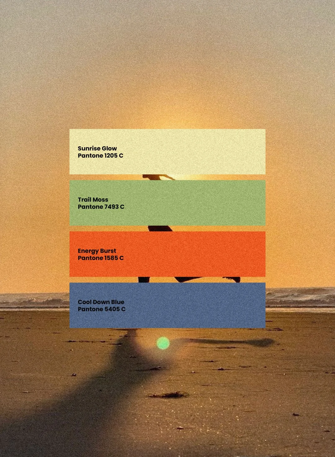
BRANDING APPROACH
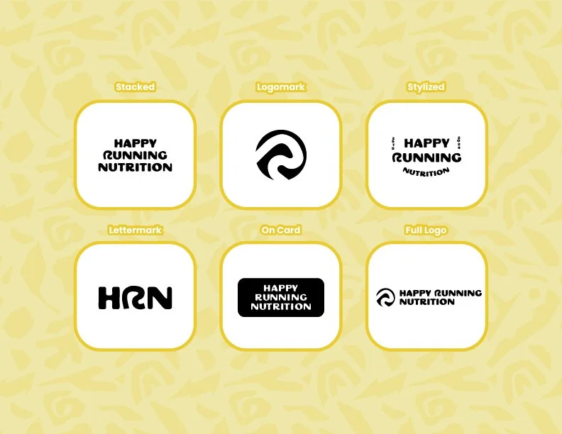
LOGOMARK CONSTRUCTION
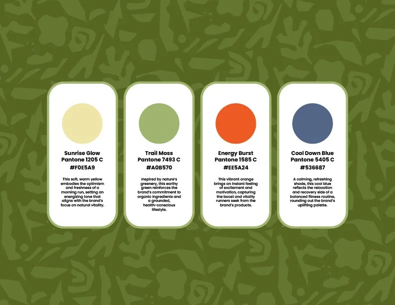
The brand system prioritizes clarity, transparency, and runner-specific utility. Typography and layout avoid heavy performance cues in favor of a friendly, credible tone that makes ingredients and benefits immediately legible. A simple hierarchy and restrained color system allow the packaging to communicate function clearly across both digital and physical touchpoints.
// 03
OUTCOME
The final system brought clarity and cohesion to the brand, making the product’s purpose immediately legible through color, hierarchy, and form. A modular structure and clear brand guidelines allow the system to scale easily across new flavors, packaging formats, and social content without losing consistency.
Flexible logo variations, patterns, and typographic structures support communication across both small packaging spaces and digital environments. The result is a brand that feels trustworthy, intentional, and built to grow.
GRAPHIC DESIGN
SELECTED WORK