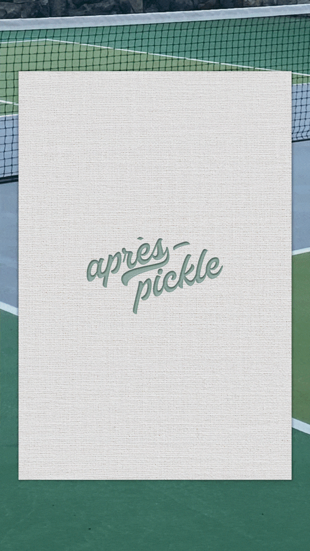
APRés pickle
©2025
A BRAND IDENTITY BUILT AROUND THE MOMENTS AFTER THE MATCH, WHERE PICKLEBALL MEETS LIFESTYLE, CULTURE, AND CONNECTION.
SCROLL FOR MORE
// 01
PROJECT OVERVIEW
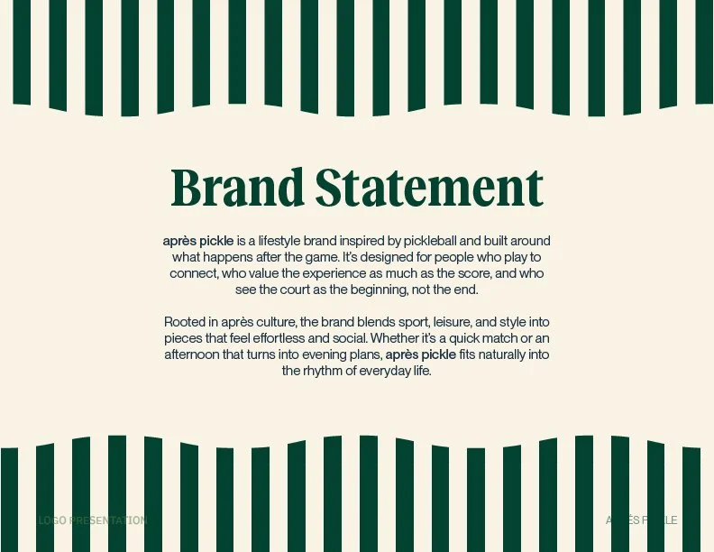
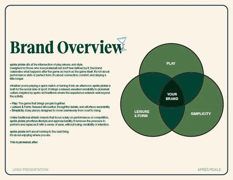
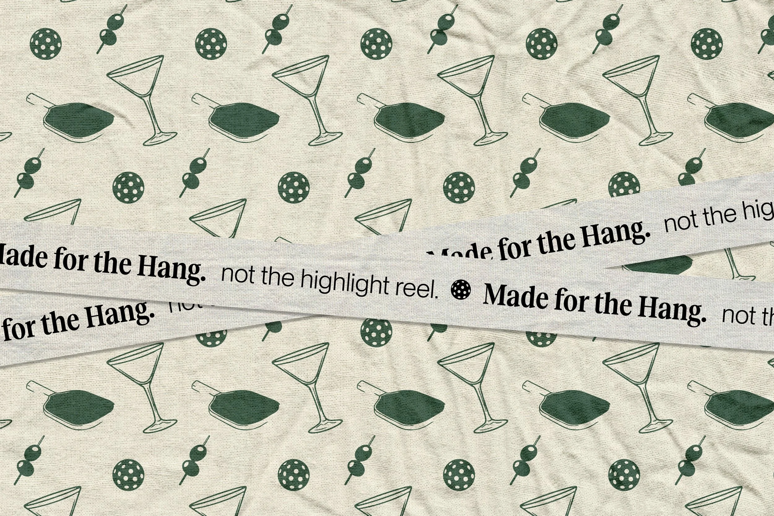
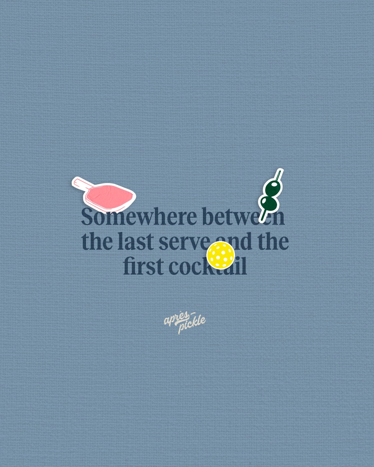
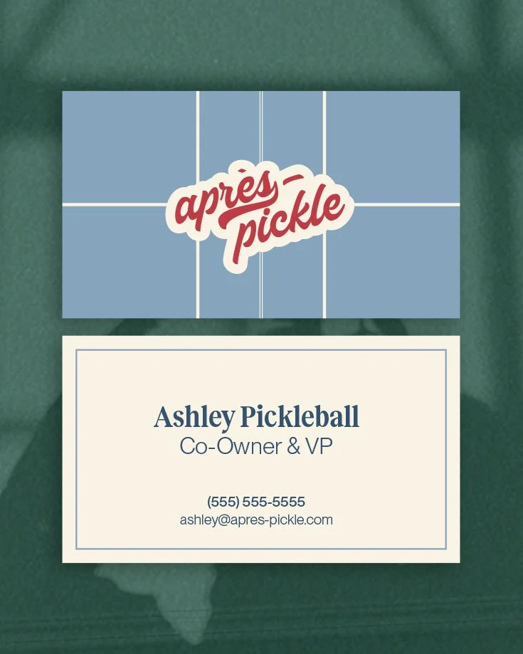
Après Pickle is a pickleball apparel brand built around the culture and social energy surrounding the game, not just competition. Originally launched as Dilly Life with limited visual direction, the brand struggled to stand out in a rapidly growing pickleball market. The goal of the rebrand was to translate the idea of après from ski culture into pickleball, shifting the focus from performance to lifestyle. The resulting identity needed to feel fun, confident, and immediately recognizable across apparel and social media.
PROVIDED SERVICES
YEAR
Creative Direction
logo & Logo SYSTem development
Pattern design
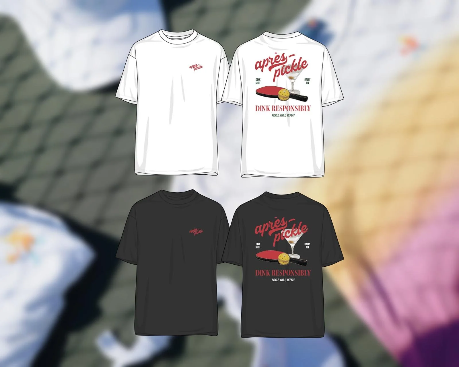
Apparel Graphics
social media Templates
2025
// 02
BRANDING APPROACH
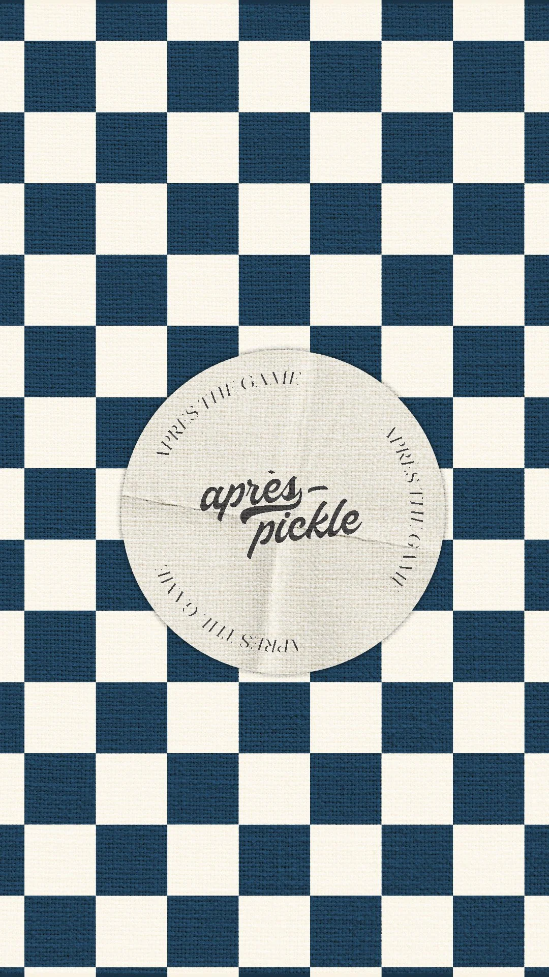
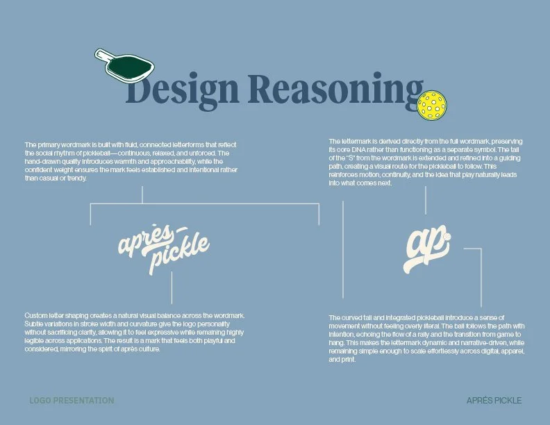
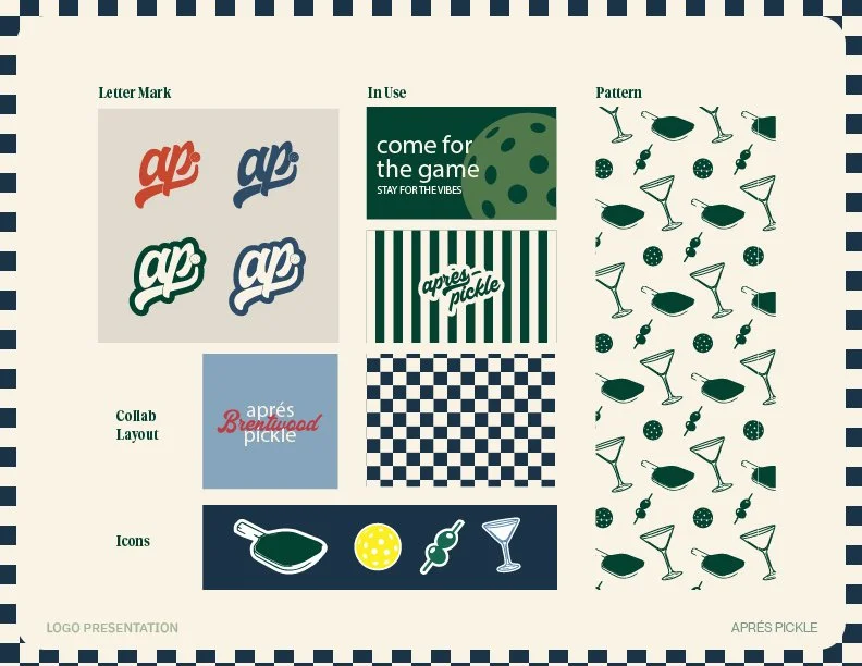
LETTERMARK CONSTRUCTION
The identity was built around the social side of pickleball, focusing on players who value the experience as much as the game itself. Visual inspiration drew from tennis culture, country clubs, and Los Angeles beach aesthetics, blending casual luxury with playful energy. The logo system emphasizes motion, texture, and contrast, using tactile references and court-inspired details to reflect the physicality of the sport. Serif and sans-serif pairings balance classic leisure cues with contemporary graphic expression, while stickers and supporting elements add personality without feeling forced.
// 03
OUTCOME
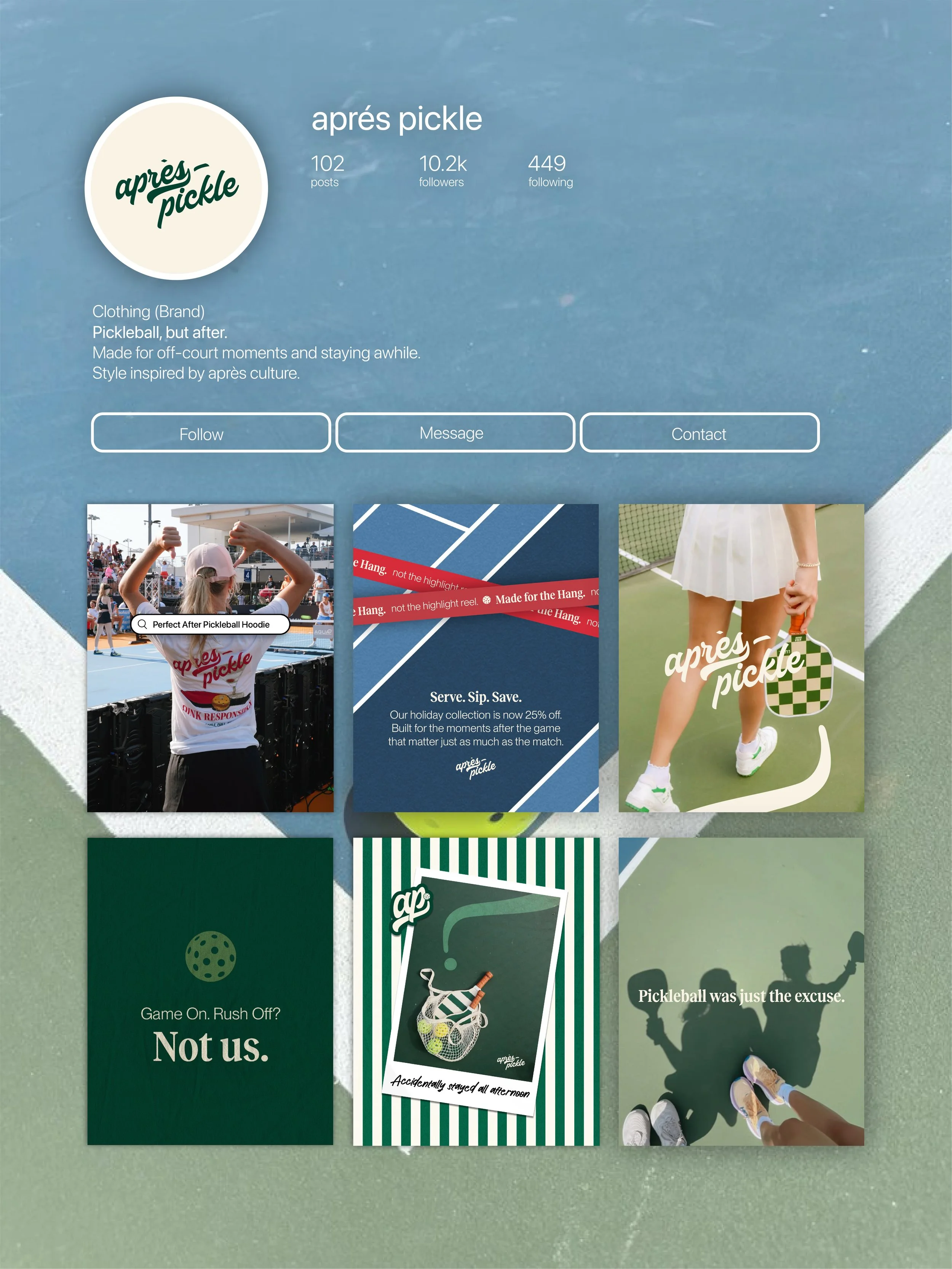
The rebrand established a clear, cohesive identity capable of carrying the concept of après across apparel, social, and physical touchpoints. Rather than relying on a single logo moment, the brand now functions as a flexible system that communicates mood, lifestyle, and personality alongside name recognition.
This clarity makes it easier to speak directly to an audience driven by culture and vibe rather than performance claims, while also providing internal teams with a reliable framework for decision-making. The result is a brand that feels intentional, repeatable, and aligned both on and off the court.
GRAPHIC DESIGN
SELECTED WORK