
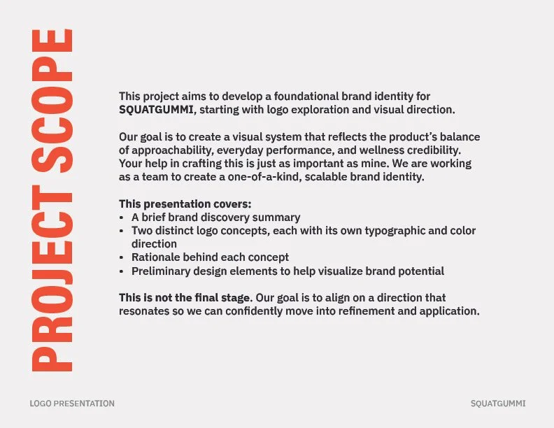
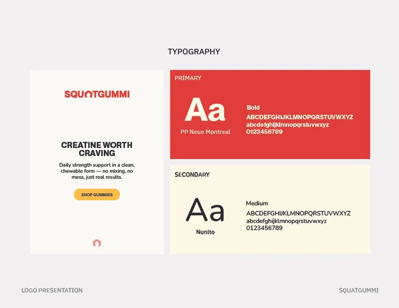
Storied Skateboarding
2025
BRAND DESIGN

Storied Skateboarding is a storytelling-focused skateboard brand built around documenting some of skateboarding’s most influential moments and figures, primarily through long-form video content on YouTube. launched alongside the brand’s first major interview, Tony Hawk. It recounted the first-ever 900 at the X Games, requiring a visual identity that could support a growing video series while extending naturally into social platforms and physical merchandise. The goal was to create a recognizable system that felt rooted in skate culture history while remaining flexible enough to scale across digital content, apparel, and collectible memorabilia.
Project Overview
Services Provided
Logo Design
Typography
Presentation Design
Apparel & Product Design
Apparel Production
YouTube Title Cards
Texture Design


Branding Approach
The identity was developed by balancing the raw, imperfect energy of skateboarding’s past with a level of refinement that made the brand approachable beyond hardcore skate audiences. Inspiration came from early graffiti, sign painting, and worn skate ramp textures—elements that feel authentic but not aggressive. Typography was established first to anchor the brand’s voice, followed by introducing motion and contrast through a bold yellow stripe and textured backgrounds. Every decision was tested against real-world use, especially motion and video overlays, ensuring the system worked just as well on-screen as it did on physical products.


Outcome
The final system gave Storied Skateboarding a flexible, recognizable identity that worked across long-form video, social platforms, and physical touchpoints. The logo system made title creation fast and consistent, allowing “Storied” to adapt easily to different series and formats while remaining legible at small sizes for YouTube thumbnails, Instagram, and TikTok. High-contrast color choices and subtle drop shadows ensured the mark stayed visible against busy backgrounds, while textured elements reinforced the brand’s connection to skate culture. Most importantly, the identity scaled seamlessly from motion graphics to signed skateboards, giving the brand a cohesive visual presence that supported both storytelling and growth without overcomplicating production.
View Additional Projects
HAPPY RUNNING NUTRition
storied skateboarding
photography