Client
Really EZ Shipping
REALLY EZ SHIPPING
Brand Identity
Product & Merchandise Design
PORTFOLIO
Application
2024
Year
Client Brief:
In the competitive landscape of third-party logistics (3PL), speed, accuracy, and seamless delivery are paramount for customers. Evan and Zach of Really EZ Shipping rise to this challenge daily.
Their design approach tackles clients' common concerns head-on, visually addressing the anxieties associated with selecting a 3PL partner to manage inventory. Establishing trust from the outset was crucial to the owners, ensuring potential clients feel confident even before their initial meeting.
Applied Design Solution:
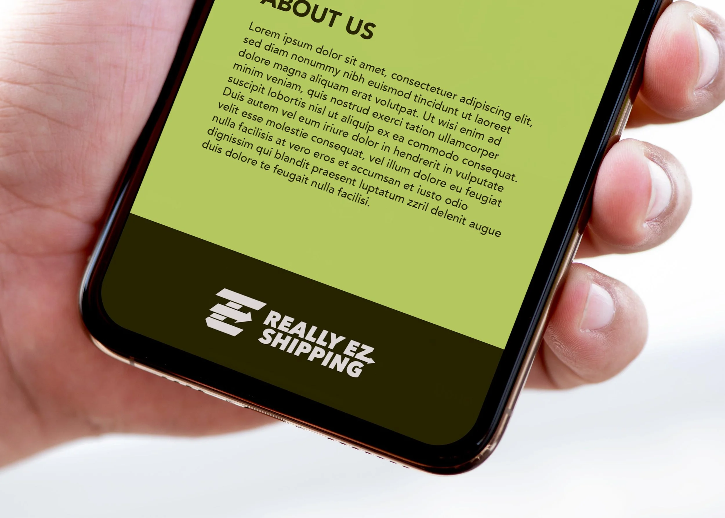
For Really EZ Shipping, speed, accuracy, and trust form the cornerstone of their brand identity. Utilizing an italicized font across the logomark and wordmark visually conveys motion and speed, immediately capturing attention.
Embedded within the logo are two subtly placed arrows pointing forward, symbolizing readiness to propel products forward. The primary green colors not only signify 'go' but also evoke trust, aligning with the archetype of the "Caregiver".
Integrating the letters "E" and "Z" from the owners' names into the bold, stable font, along with a hidden arrow motif, ensures that Really EZ Shipping's commitment to reliability is apparent even before the first introductory call.


