
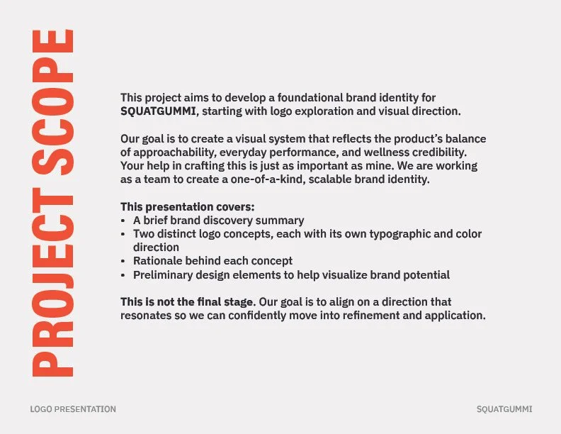
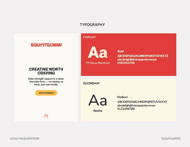
Storied Skateboarding
2025
BRAND DESIGN

Cali Extrax is a Delta-8 brand producing multiple product lines under a single umbrella, each with its own visual theme and audience appeal. While the parent brand was established, the company needed new packaging systems for a growing set of sub-brands designed to stand out on crowded retail shelves while remaining cohesive across SKUs, formats, and display types. The goal was to create distinctive packaging for single-serve units, multipacks, and countertop displays that could support rapid product expansion without sacrificing clarity or shelf impact.
Project Overview
Services Provided
Creative Direction
Packaging Design
Dieline Development
Production File Preparation
Color Theory & SKU System Design


Branding Approach
The approach began with understanding the core demographic, primarily younger men shopping in visually saturated retail environments where shelf presence and immediate differentiation are critical. Each product line was treated as its own visual concept while still living under the Cali Extrax umbrella, often starting with a strong thematic hook (such as money bands or vault imagery) and building packaging structures around that idea. Design decisions prioritized bold color, clear hierarchy, and fast readability, while systems thinking ensured the packaging could scale across multiple SKUs, box sizes, and future product extensions without becoming inconsistent or confusing.


Outcome
The resulting packaging systems brought clarity and consistency across multiple product lines while allowing each release to feel distinct and intentional. New visual directions opened additional sales opportunities by appealing to different audiences without fragmenting the brand, and the packaging now communicates product information quickly and confidently at shelf level. Internally, the introduction of structured workflows and standardized information intake streamlined production, reduced back-and-forth, and made it easier to launch new styles efficiently. This project reinforced the importance of balancing audience-first design with strong organization, proving that even fast-moving, high-volume product lines benefit from thoughtful systems and clear creative direction.
View Additional Projects
HAPPY RUNNING NUTRition
storied skateboarding
photography